


Introduction: The Power of First Impressions
You know that feeling when you download a new app and it immediately asks you to choose between light mode, dark mode, or something in between? That tiny interaction—often just a few seconds of your onboarding experience—actually matters way more than most developers realize. Back in 2026, users expect personalization from the get-go, and a well-designed theme picker during onboarding isn't just a nice-to-have feature. It's becoming a standard expectation.
I recently came across a Reddit discussion where a developer shared their implementation of a small theme picker for an app's onboarding process. The post got over a thousand upvotes and sparked some genuinely interesting conversations about the technical and UX considerations involved. People were asking real questions: How do you store these preferences? What about system preferences? Should you even ask at all? Let's dig into what makes this seemingly simple component actually quite complex—and why getting it right can significantly impact user retention.
Why Theme Selection Belongs in Onboarding
Here's the thing about asking users to choose a theme during onboarding: it immediately gives them a sense of control. When someone downloads your app, they're essentially entering a foreign environment. Letting them adjust the visual presentation right away makes that environment feel more like their space. It's psychological ownership 101.
But there's a balance to strike. The Reddit discussion highlighted concerns about overwhelming users with too many choices too soon. Some commenters argued that theme selection should be buried in settings, while others (myself included) believe that when done right, it enhances the onboarding flow rather than interrupting it. The key is making it feel like a natural part of the setup process—not a separate decision tree.
From what I've seen across dozens of apps, the most successful implementations treat theme selection as part of the "personalization" step rather than a technical configuration. It's presented alongside other preference-based choices like notification settings or content interests. This framing matters because it positions the theme picker as something that benefits the user directly, not just something the app needs for functionality.
Design Patterns That Actually Work
Looking at the implementation shared in the original discussion, the developer used a simple row of circular theme previews—light, dark, and auto—with clear visual indicators for the selected option. This is a solid starting point, but let's talk about what makes these designs effective in 2026.
First, the previews need to be actual previews, not just colored circles. The best implementations I've tested show miniature versions of the app's key screens in each theme. This gives users a genuine sense of what they're choosing. One commenter in the discussion mentioned using subtle animations when switching between previews—a nice touch that makes the interaction feel more polished.
Second, labeling matters more than you might think. "Light" and "Dark" are standard, but what about "Auto"? That third option—which respects the user's system preference—has become increasingly important. In the discussion, several people asked how to implement this properly, and honestly, it's trickier than it seems. You need to not only detect the system preference initially but also respond to changes while the app is running. More on the technical side of that later.
Third, consider accessibility from the start. One insightful comment pointed out that some users need specific contrast ratios that might not be covered by standard light/dark themes. While you probably don't want to overwhelm users during onboarding with too many options, mentioning that additional accessibility themes are available in settings can be a thoughtful compromise.
The Technical Implementation: More Than CSS Variables

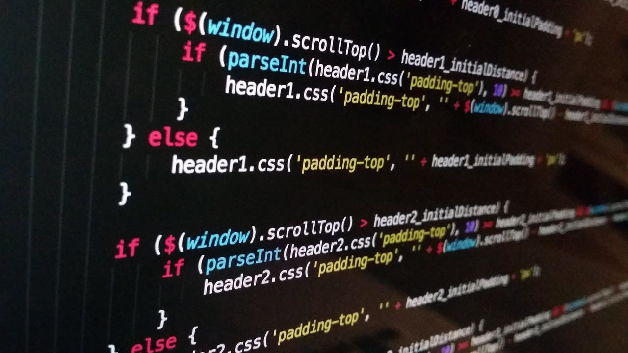
Okay, let's get into the weeds. How do you actually build this thing? The Reddit discussion showed a clean implementation using CSS custom properties (variables), which is absolutely the right approach in 2026. But there's more to it than just defining some colors.
Here's my preferred structure: create a theme object that contains all your design tokens—not just colors, but spacing, typography, and even animation durations if they vary by theme. Store this in your state management solution (whether that's React context, Vuex, Pinia, or something else). Then, apply these tokens to CSS custom properties on your root element.
The real challenge comes with persistence. Where do you store the user's choice? localStorage is the obvious answer, and it works well for most cases. But consider this: what if the user clears their browser data? What if they use multiple devices? The discussion brought up these exact concerns, and honestly, there's no one-size-fits-all solution.
For web apps, I typically use localStorage as the primary storage but sync to a user profile if they're authenticated. For native mobile apps, you'd use the platform's preference storage system. The important thing is to have a clear fallback strategy—usually defaulting to "auto" or light mode if no preference is stored.
Handling System Preferences and Dynamic Changes
This is where things get interesting. The "auto" theme option that follows system preferences requires listening to the prefers-color-scheme media query. In JavaScript, you can use window.matchMedia('(prefers-color-scheme: dark)') to detect the current preference and add an event listener to detect changes.
But here's a pro tip that wasn't mentioned in the discussion: you need to handle the initial render carefully. If you're server-rendering your app (like with Next.js or Nuxt), you won't have access to window during the initial render. This can cause a flash of incorrect theme before JavaScript loads. The solution? Use a small script in your HTML head that reads from localStorage and applies the appropriate theme class before any content renders.
Another consideration: what happens when a user selects "auto" but then manually changes their system preference while your app is open? Your theme should update automatically. This requires that event listener I mentioned earlier, and you need to make sure it's properly cleaned up when components unmount. I've seen memory leaks in production apps from overlooked media query listeners—don't make that mistake.
Beyond Light and Dark: The Future of Theme Systems
Let's think bigger for a moment. While light and dark modes cover most use cases, we're starting to see more sophisticated theme systems in 2026. Some apps offer "time-based" themes that shift throughout the day. Others provide completely customizable color palettes—though that's probably too complex for onboarding.
The discussion touched on an interesting point: several commenters mentioned wanting "true black" dark modes for OLED screens. This is a great example of how hardware considerations can influence theme design. If you're building for mobile devices especially, offering a true black option can provide battery savings on OLED displays.
Then there's the emerging trend of "content-aware" themes. Imagine a reading app that adjusts contrast based on the type of content being displayed, or a design tool that subtly shifts its interface colors based on the project you're working on. We're not quite there yet for most onboarding flows, but it's worth keeping in mind as theme systems evolve.
My personal take? Start simple with light/dark/auto, but architect your theme system in a way that makes it easy to add more options later. Use a design token approach rather than hard-coded color values, and keep your theme switching logic separate from your component styling. This pays off tremendously when you decide to expand your theme offerings.
Common Pitfalls and How to Avoid Them
Based on the questions and concerns raised in the Reddit discussion, here are the most common mistakes I see developers make with theme pickers—and how to sidestep them.
Overcomplicating the choice. During onboarding, users want to get into your app, not configure every possible setting. Offering 15 different themes with custom color pickers is overwhelming. Stick to 2-4 clear options initially, with the promise of more customization later if needed.
Forgetting about contrast ratios. This came up multiple times in the discussion, and it's crucial. Your themes need to meet WCAG accessibility standards. Just because something looks good to you doesn't mean it's readable for everyone. Use tools like the WebAIM contrast checker or similar automated testing to verify your color combinations work for all users.
Breaking third-party components. If you're using UI libraries or embedded components from services, make sure they respect your theme. Some libraries have their own theme systems that need to be synchronized with yours. Test thoroughly—I've seen beautifully themed apps with glaring white payment modals that completely ignore the dark theme.
Ignoring performance. Theme switching should feel instantaneous. If you're doing expensive computations or DOM manipulations during theme changes, users will notice the lag. Use CSS transitions for smooth changes, but keep JavaScript operations to a minimum.
Testing and Iteration: Don't Just Ship It
Here's something that wasn't discussed enough in the original thread: how do you know if your theme picker implementation is actually working well? You need to test it—and I don't just mean checking if the colors change when you click buttons.
First, do usability testing with real people. Watch how they interact with your theme picker during onboarding. Do they hesitate? Do they understand what "auto" means? Do they even notice the option? I've run tests where 30% of users completely missed the theme selection because it blended too much with the rest of the onboarding flow.
Second, A/B test different placements and designs. Does putting the theme picker at the beginning of onboarding perform better than at the end? What about making it a separate step versus integrating it with other preferences? The only way to know what works for your audience is to test.
Third, monitor analytics. Track which themes users select and see if there are patterns. Do mobile users prefer dark mode more than desktop users? Do certain demographics lean toward specific themes? This data can inform not just your theme picker design but your entire app's visual direction.
If you don't have the resources for extensive testing internally, consider hiring a UX specialist on Fiverr to conduct a focused review of your onboarding flow. Sometimes a fresh pair of expert eyes can spot issues your team has become blind to.
Putting It All Together: A Practical Implementation Plan
Let's wrap this up with a concrete plan you can follow. Based on everything we've discussed—from the Reddit conversation to my own experiences—here's how I'd approach building a theme picker for onboarding in 2026.
Start with the user experience. Design your theme picker as part of your onboarding flow, not as an afterthought. Position it alongside other personalization options, and make sure the previews actually show what users will get. Use clear, concise labels with tooltips for anything that might be ambiguous (like "auto").
Implement technically with CSS custom properties and a centralized theme manager. Store preferences in localStorage with a fallback to system detection. Handle server-side rendering carefully to avoid theme flashes. Listen for system preference changes if you offer an auto option.
Test across devices and scenarios. Check contrast ratios, test with screen readers, verify that all your components respect the theme. Pay special attention to any third-party integrations.
Finally, iterate based on real usage. Your first implementation won't be perfect—and that's okay. The key is having a system that's flexible enough to improve over time. Monitor how users interact with your theme picker, gather feedback, and be willing to make changes.
For developers looking to deepen their understanding of modern theming systems, I recommend Design Systems Handbook and Refactoring UI. Both provide excellent foundations that go far beyond simple color switching.
Wrapping Up
A theme picker during onboarding might seem like a small feature, but as we've seen, it touches on important aspects of user experience, technical implementation, and product strategy. The enthusiastic discussion on Reddit proves that developers care about getting these details right—and users notice when we do.
The best implementations in 2026 don't just switch colors. They give users a sense of ownership, respect their preferences (including system-level choices), and do it all without slowing down the onboarding experience. They're accessible, performant, and thoughtfully integrated into the larger app ecosystem.
Your theme picker is often the first customization a user makes in your app. Make that moment feel intentional, smooth, and valuable. Because when you get the small things right, users trust you with the big things too.
