


The Great Notion Color Rebellion of 2026
If you've spent any time in productivity circles lately, you've heard the frustration. It starts as a quiet grumble—"Why can't I just use regular yellow?"—and builds into something louder. By 2026, what began as minor annoyance has become a full-blown user revolt. Notion, the beloved all-in-one workspace, has a color problem. And people are getting fed up.
I've watched this unfold across forums, Reddit threads, and Twitter conversations. The original Reddit post that sparked this article wasn't an outlier—it was a rallying cry. "You have a terrible color palate, and you force it upon everyone," the user wrote, capturing what thousands were feeling. That post got 604 upvotes and 55 passionate comments in just days. This isn't about aesthetics alone. It's about functionality being limited by design choices that feel, frankly, arbitrary.
What's fascinating is how personal this gets. People aren't just complaining about colors—they're describing how Notion's limitations affect their actual work. They're going back to Google Sheets for projects. They're creating convoluted workarounds. Some are even considering abandoning Notion entirely. That's the real story here: when a productivity tool gets in the way of productivity, something has gone wrong.
Why Colors Matter More Than You Think
Let's get one thing straight—this isn't about making things "pretty." Color serves fundamental cognitive functions in productivity tools. Think about how you use color in your workflow. You highlight urgent items in red. You mark completed tasks in green. You use yellow for important notes. These aren't arbitrary choices—they're visual shortcuts that help your brain process information faster.
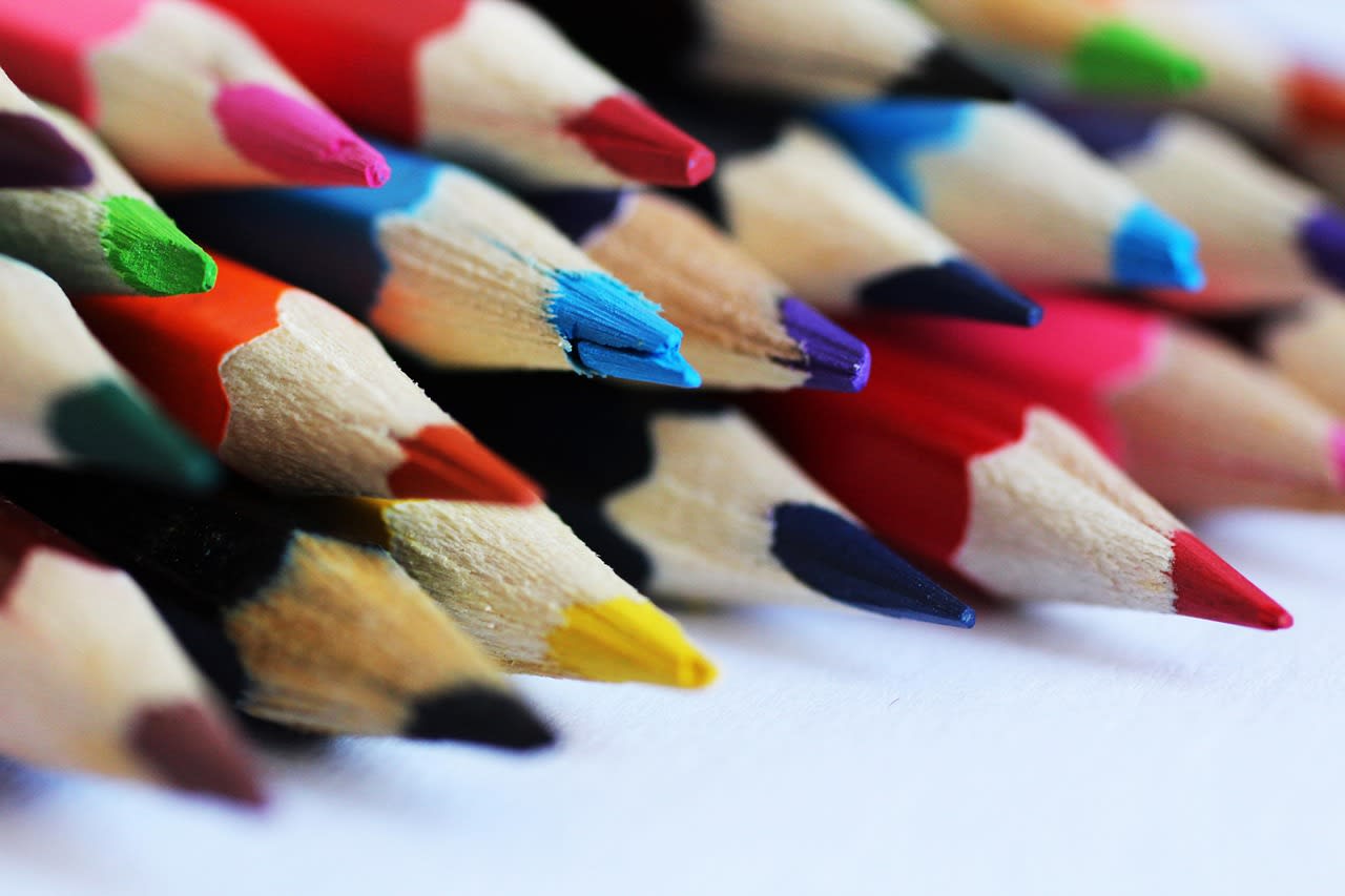
Notion's current palette, while cohesive from a design perspective, fails at practical application. The "highlight" colors—what Notion calls text background colors—are particularly problematic. They're muted, they don't contrast well with text, and they lack the visual punch of standard highlighters. That "regular highlight yellow" the Reddit user mentioned? It's not just about nostalgia for physical highlighters. It's about a color that's been scientifically shown to draw attention effectively while remaining readable.
And here's where it gets interesting: other tools understand this. Google Docs gives you six highlight colors that actually look like highlighters. Apple Notes uses familiar, high-contrast colors. Even Microsoft Word, not exactly known for cutting-edge design, lets you choose from a full spectrum. Notion stands almost alone in its restrictive approach. Which makes you wonder: what's the reasoning behind it?
The Design Philosophy Behind the Limitations
To understand Notion's color choices, you need to understand their design philosophy. Notion has always prioritized consistency and minimalism. Their approach seems to be: "We'll give you just enough customization to be useful, but not so much that things get messy." It's the same thinking behind their limited font choices and controlled layout options.
There's logic here, honestly. Unlimited color choices can lead to visual chaos. I've seen Notion pages that look like a rainbow exploded—every block a different color, no visual hierarchy, complete information overload. Notion's designers likely want to prevent that. They're curating an experience, maintaining brand consistency, and ensuring that shared pages remain readable across devices and user preferences.
But—and this is a big but—there's a difference between guidance and restriction. Right now, Notion feels restrictive. The palette they've chosen isn't just limited; it's often poorly suited for actual use. The blues are too similar. The greens don't pop. The "gray" options barely show up on some screens. It's like they designed for a design portfolio rather than for people trying to get work done.
What's particularly frustrating is how this philosophy contradicts Notion's core promise of flexibility. You can build entire databases, create complex relations, embed multimedia—but you can't pick a proper highlight color? The cognitive dissonance is real.
Real-World Consequences: When Colors Break Workflows

Let me give you concrete examples from my own experience and from what users are reporting. First, the simple memo problem mentioned in the original post. You want to highlight a key term in a document. In Notion, you get eight text background colors. None of them provide the clear, high-contrast marking of a traditional highlighter. The yellow is mustard-like, the green is minty and faint, the red is more pink than alert-red.
Now scale this up. Database views become harder to parse at a glance. Status indicators blend together. Priority systems fail because "high priority red" and "medium priority orange" look too similar. I've watched teams create elaborate emoji-based systems because the color coding wasn't distinctive enough. That's right—they're using 🟥🟨🟩 instead of actual colors because the actual colors don't work.
Then there's accessibility. Color contrast matters for readability, especially for users with visual impairments. Notion's current palette has questionable contrast ratios on several combinations. Users who rely on specific color schemes for accessibility reasons—like those with color blindness—have limited options. They're essentially told: "Our design preferences matter more than your ability to use our product."
And here's the kicker: people are leaving. The Reddit user mentioned going back to Google Sheets. I've spoken to project managers who've migrated to ClickUp specifically for better customization. Design teams are using Figma for documentation because they need precise color control. These aren't edge cases—they're real workflows breaking because of color limitations.
The Competitor Landscape: What Everyone Else Is Doing
This is where Notion's position looks particularly odd. Let's look at the competition in 2026. Coda offers extensive color customization—you can use hex codes for practically everything. Craft has a beautiful, functional palette with more options than Notion. Even simpler tools like Bear and Obsidian give users more color control for highlighting and theming.
Google Workspace deserves special mention here. The original post specifically called out Google Sheets as an alternative, and there's a reason. Google's color pickers are comprehensive without being overwhelming. You get a basic palette plus custom color selection. You can match brand colors. You can ensure accessibility compliance. And—crucially—the colors actually work for their intended purposes.
What's interesting is how these tools handle the "chaos" problem. Most offer curated default palettes but allow customization for power users. Some include color validation for accessibility. Others let workspace admins set brand colors that everyone can use. These are solved problems! Notion could implement similar systems tomorrow if they wanted to.
The question becomes: why hasn't Notion? Is it technical debt? A philosophical hill they're willing to die on? Or simply not a priority? Based on community sentiment in 2026, it's becoming a business risk. When your differentiator is flexibility, limiting something as basic as color starts to undermine your entire value proposition.
Practical Workarounds (That Shouldn't Be Necessary)
Okay, enough complaining. Let's talk solutions. While we wait for Notion to (hopefully) improve their color system, here are workarounds I've collected from power users. None are perfect, but they help.
First, the callout block trick. Notion's callout blocks have slightly better colors than text highlights. You can create a callout, change its color, then remove the icon and adjust padding to make it look like a colored text box. It's clunky, but it gives you more options for background colors.
Second, database property tricks. For database rows, you can use formulas and rollups to dynamically assign colors based on conditions. It's overkill for simple coloring, but it works. You create a "color" property with select options, then use that to conditionally format other properties. Complex? Yes. Functional? Sometimes.
Third, the image overlay method. Some users create transparent PNGs with colored backgrounds and place them behind text. This is... honestly, it's ridiculous that people are doing this. But it works for creating custom highlight effects on important pages.
Fourth, browser extensions. As of 2026, a few community-developed extensions attempt to override Notion's colors. Use these with caution—they can break, they're not official, and they might violate terms of service. But they exist because the demand exists.
Here's my personal approach: I use Notion's limited palette strategically. I reserve certain colors for specific meanings across all my pages. Red only for deadlines. Green only for completed items. Blue for references. It's not ideal, but it creates consistency within the constraints. And I supplement with icons and emojis for additional visual cues.
What Notion Could (And Should) Do in 2026
Let's dream for a moment. What would a better Notion color system look like? Based on user feedback and competitor analysis, here's what I think they should implement.
First, expand the basic palette. Give us at least 12-15 well-chosen colors that actually serve different functions. Include proper highlight colors, distinct status colors, and better neutrals. This is the bare minimum.
Second, add a custom color picker. Let users input hex codes or choose from a color wheel. This is standard in 2026—there's no excuse not to have it. To prevent chaos, make it a "power user" feature tucked behind an "Advanced" toggle. Or limit it to workspace admins who can set brand colors.
Third, implement color accessibility tools. Add contrast checking. Include color blindness simulators. Suggest accessible alternatives when users pick problematic combinations. Notion positions itself as a tool for teams—accessibility should be built in, not an afterthought.
Fourth, create color presets and themes. Let users save custom color sets. Allow sharing of color themes across a workspace. This maintains consistency while allowing flexibility. Designers could create beautiful, functional themes that everyone benefits from.
Fifth—and this is important—improve the color application interface. Right now, changing colors in Notion feels buried. Make it faster. Add keyboard shortcuts. Let us apply colors to multiple elements at once. The friction of using colors contributes to the problem.
Realistically, Notion could implement most of this within their existing framework. The database property system already handles conditional formatting. The block system supports color changes. The infrastructure is there—they just need to expand the options.
The Community's Voice: What Users Are Really Saying
Reading through hundreds of comments and forum posts, certain themes emerge repeatedly. It's not just about more colors—it's about specific use cases that current colors fail.
Education users need better highlighting for study notes. The current options don't match physical highlighters, making digital note-taking less effective. Teachers creating shared materials need distinct colors for different concepts. Right now, they're using workarounds or different tools.
Developers using Notion for documentation want syntax highlighting-like colors. The muted palette doesn't provide enough distinction between code types, parameters, and outputs. They end up using code blocks inside other tools, breaking the "all-in-one" promise.
Design teams need to match brand colors. When presenting to clients or creating style guides, they need precise color reproduction. "Close enough" isn't acceptable when brand guidelines specify Pantone values.
Accessibility advocates keep pointing out the contrast issues. They're not asking for rainbow explosions—they're asking for colors that everyone can distinguish. This isn't a niche concern; it's about basic usability.
And then there's the emotional component. Users feel patronized. They're told, "We know what's best for you," when their actual experience says otherwise. This erodes trust. When a tool you rely on consistently ignores a basic request, you start wondering what else they'll ignore.
Looking Ahead: Will Notion Listen in 2026?
Here's what gives me hope. Notion has listened before. They added dark mode after user requests. They improved database relations. They've gradually expanded features based on feedback. The question is whether color customization rises to that level of priority.
The evidence suggests it should. When a Reddit post gets hundreds of upvotes and dozens of comments agreeing with a specific pain point, that's data. When users mention switching to competitors specifically for color features, that's a business metric. When workarounds become elaborate enough to be their own tutorials, that's a sign of unmet need.
My prediction? Notion will address this, but gradually. We might see expanded palettes first, perhaps tied to a "Notion Pro" tier. Custom colors might come later, possibly as an enterprise feature. The accessibility improvements might arrive as part of a broader inclusivity initiative.
But here's what I'd tell Notion if I could: this isn't just a feature request. It's about respecting your users' workflows. It's about recognizing that people use your tool in ways you didn't anticipate—and that's a good thing! The beauty of Notion is its flexibility. Don't undermine that with unnecessary restrictions.
For now, users continue with workarounds, complaints, and hopeful feature requests. The community isn't giving up—the discussion keeps growing. And that pressure, sustained over time, is what drives change in software development.
Your Next Steps as a Notion User
So what should you do right now? First, use the workarounds that work for you. Don't let color limitations completely block your productivity. Sometimes good enough is better than perfect.
Second, provide specific feedback to Notion. Don't just say "more colors." Explain your use case. Describe how color limitations affect your actual work. Share examples. Feedback like "I need to highlight medical terms in study notes, and your yellow doesn't provide enough contrast" is more useful than "your colors suck."
Third, explore alternatives for specific use cases. Maybe you keep project management in Notion but do detailed documentation in another tool. Hybrid approaches are valid. The goal is productivity, not tool loyalty.
Fourth, connect with the community. Share your workarounds. Learn from others. The collective knowledge in places like r/Notion is incredible. You're not alone in this frustration, and together, users have developed some clever solutions.
Finally, be patient but persistent. Software development takes time. Good design decisions take iteration. Notion's team is undoubtedly aware of this issue by now—the question is when and how they'll address it.
The color rebellion continues. Whether it leads to revolution or compromise remains to be seen. But one thing's clear: users have spoken, and they're not going quietly back to mustard yellow highlights.
