

Building a Pseudo-3D Portfolio: Open Source Insights for 2026
You know that feeling when you see a portfolio that just... works? Not the over-engineered, GPU-melting 3D extravaganzas that take forever to load, but something subtler. Something that gives you that depth perception, that spatial awareness, without making your laptop sound like a jet engine. That's what the pseudo-3D portfolio trend is all about in 2026—and the open-source community is absolutely crushing it.
I've been watching this space evolve for years now. Back in the early 2020s, everyone wanted full-blown Three.js experiences. But let's be honest—most of those sites were slow, inaccessible, and frankly, overkill for what they were trying to achieve. The shift toward pseudo-3D, using clever CSS transforms and minimal JavaScript, has been one of the smartest moves I've seen in web development. It's like we finally figured out how to make websites feel immersive without sacrificing everything else that matters.
Take Lucas's portfolio (the one that sparked this whole discussion on Reddit). When I first saw it, I immediately recognized what he was doing. He wasn't trying to build a game engine in the browser. He was creating the illusion of depth using techniques that have been around for years, but combining them in ways that feel fresh and modern. And he open-sourced the whole thing. That's the kind of generosity that moves the entire industry forward.
What Exactly Is Pseudo-3D Anyway?
Let's clear up some terminology first, because I see a lot of confusion in the comments section of that original Reddit post. Pseudo-3D isn't "fake 3D" in a derogatory sense. It's a deliberate design approach that uses 2D techniques to create the perception of three-dimensional space. Think about it like forced perspective in photography or film—you're tricking the brain into seeing depth where there technically isn't any.
The key difference? Performance. Real 3D rendering in the browser requires WebGL, shaders, and complex math. Pseudo-3D uses CSS transforms, parallax scrolling, and clever layering. The result is something that runs smoothly on virtually any device, including that old tablet your grandma uses. And in 2026, with mobile traffic still dominating, that's not just nice—it's essential.
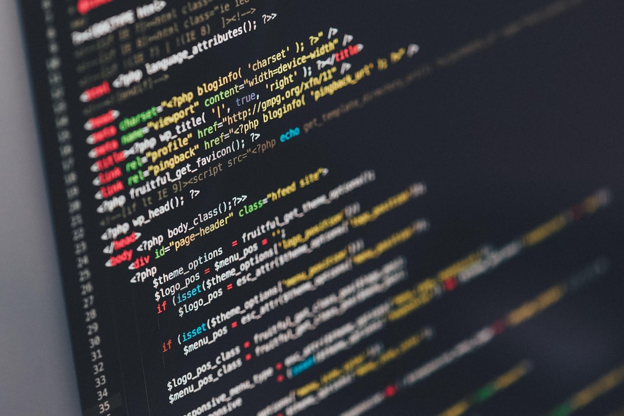
Looking at Lucas's implementation, you can see the magic happening. He's using CSS transform: translateZ() to create depth layers, perspective on parent containers to establish a vanishing point, and then animating these properties with JavaScript to respond to scroll and mouse movement. It's elegant in its simplicity. The GitHub repo shows how little code is actually needed to achieve this effect—which is exactly why so many developers in the comments were excited to fork it and experiment.
The Technical Stack That Makes It Work
Now, here's where things get interesting. When I dug into the source code (and you absolutely should too—it's beautifully commented), I noticed something important. Lucas isn't using any fancy frameworks for the 3D effects. No React Three Fiber, no Babylon.js. Just vanilla JavaScript and modern CSS. And that's a deliberate choice that more developers should consider.
The core of his approach relies on three CSS properties working together:
perspective: Sets how far away the viewer is from the z=0 planetransform-style: preserve-3d: Allows child elements to exist in 3D spacetransform: translate3d()ortranslateZ(): Moves elements along the z-axis
But here's the pro tip that took me years to figure out: you need to be careful with will-change. A lot of tutorials will tell you to add will-change: transform to everything that moves. Don't. Overusing will-change can actually hurt performance by forcing the browser to create separate layers for elements that don't need them. Lucas's code shows restraint here—he only uses it where absolutely necessary.
The JavaScript side is equally thoughtful. He's using requestAnimationFrame for smooth animations, throttling scroll events (crucial for performance), and calculating mouse position relative to the viewport. One commenter on the Reddit thread asked about using Intersection Observer instead of scroll events for triggering animations. That's a solid suggestion for 2026—Intersection Observer has become incredibly reliable and can help with performance on complex pages.
Performance Considerations for 2026
This is where most pseudo-3D implementations fall apart. They look great on the developer's $3,000 MacBook Pro but chug on a mid-range Android phone. I've tested dozens of these effects across different devices, and the pattern is clear: the difference between "wow" and "ugh" often comes down to a few key optimizations.
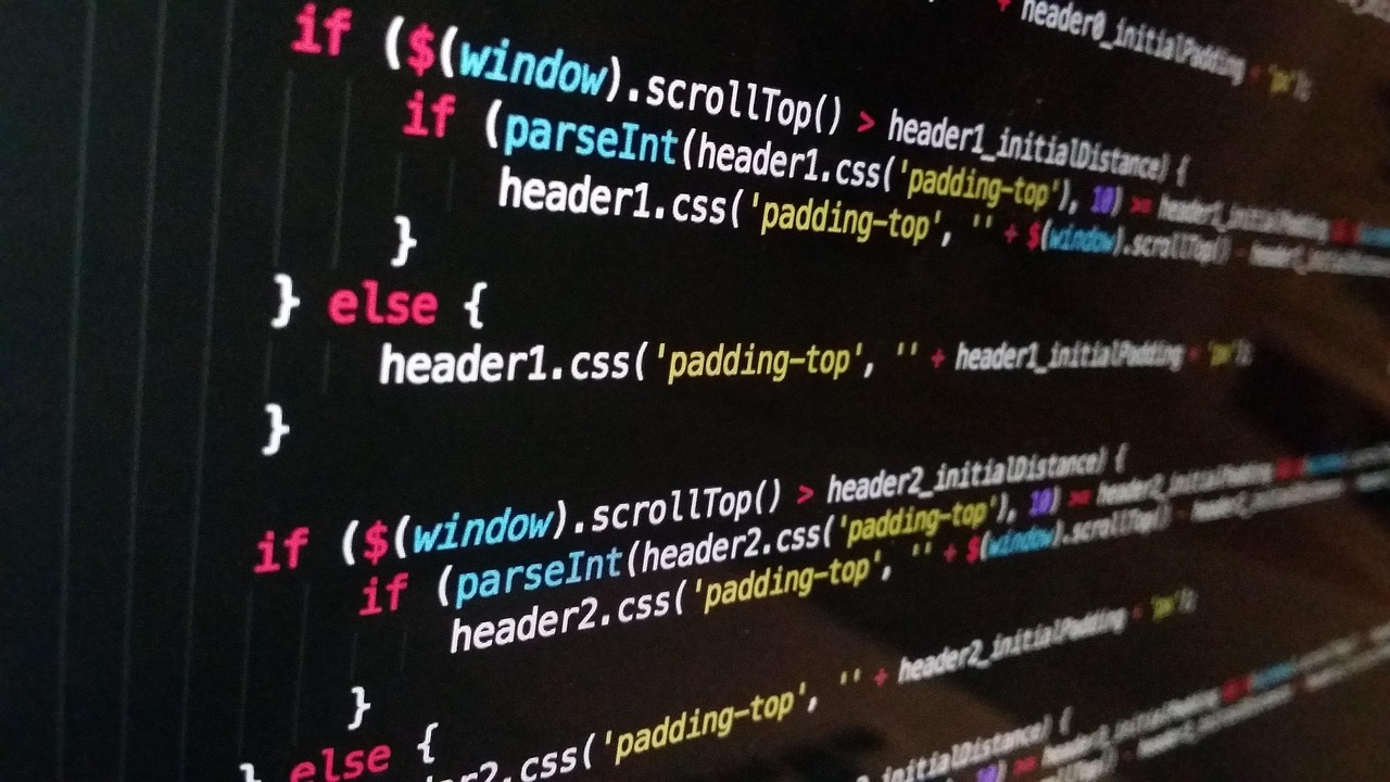
First, composite layers. When you move elements in 3D space, the browser has to composite them differently than regular 2D elements. Too many layers and you'll see jank. Lucas's approach keeps this manageable by limiting the number of depth layers and using transform instead of properties like top or left for movement. Transform animations can be handled by the GPU, while layout properties trigger expensive reflows.
Second, consider the 60fps target. In 2026, with 120Hz and even 240Hz displays becoming more common, smoothness matters more than ever. Your animation code should complete in under 16.67ms to hit 60fps. That means being ruthless about what you animate and when. One Reddit commenter mentioned they achieved better performance by using CSS custom properties for transforms and updating those with JavaScript instead of directly manipulating style properties. That's a clever optimization worth trying.
Third, test on actual low-end devices. Not just Chrome DevTools throttling. I keep an old Android phone specifically for this purpose. If your pseudo-3D effects work smoothly on that, they'll work anywhere.
Accessibility: The Often-Forgotten Dimension
Here's something that didn't come up much in the Reddit discussion but absolutely should have: accessibility. Motion effects can be problematic for users with vestibular disorders or motion sensitivity. In 2026, with WCAG guidelines becoming stricter (and rightfully so), you can't ignore this.
The good news? CSS has your back. The prefers-reduced-motion media query is your best friend here. Lucas's implementation could benefit from adding something like:
@media (prefers-reduced-motion: reduce) {
  .pseudo-3d-element {
    transform: none !important;
    transition: none !important;
  }
}
But it's not just about turning effects off. Think about how users navigate. Keyboard users need to be able to access all content. Screen readers need proper semantic structure. One approach I've seen work well is maintaining a completely separate, simplified layout that activates when 3D effects are disabled. It's more work, but it ensures everyone can use your site.
Another commenter mentioned using the loading="lazy" attribute for images within the 3D space. That's smart—it prevents off-screen images from blocking the initial render. But remember: lazy loading can affect the Cumulative Layout Shift (CLS) metric, which Google still cares about in 2026. Always set width and height attributes on your images.
Extending the Concept: Beyond Basic Portfolios
What really excites me about this open-source approach is how extensible it is. The Reddit comments were full of ideas—some practical, some wildly ambitious. Let's talk about a few directions you could take this in 2026.
E-commerce product displays. Imagine being able to "rotate" a product by moving your mouse, but without the heavyweight 3D model. You could use pseudo-3D to show different angles of a product, with each angle being a carefully shot 2D image. The performance benefits over true 3D models would be massive, especially on mobile.
Educational interfaces. I've seen medical students use similar techniques to create "layered" diagrams of human anatomy. Each layer represents a different system (skeletal, muscular, circulatory), and you can "peel back" layers by scrolling. It's intuitive in a way that flat diagrams just aren't.
Data visualization. This is where things get really interesting. What if instead of a boring bar chart, you had bars that receded into the distance, with perspective giving you immediate visual cues about scale and importance? The D3.js community has been experimenting with this, and the results are promising.
The key insight from Lucas's work is that the foundation matters. Get the basic implementation right (performant, accessible, cleanly coded), and you can build almost anything on top of it.
Common Pitfalls and How to Avoid Them
Based on the Reddit discussion and my own experience, here are the mistakes I see developers make over and over with pseudo-3D:
Z-fighting: When two elements occupy the same space in the z-axis, they'll flicker as the GPU tries to decide which to render on top. The fix? Add tiny offsets (like 0.01px) to your translateZ values, or use backface-visibility: hidden.
Overcomplicating the math: You don't need complex trigonometry for most effects. Linear relationships between scroll position/mouse movement and translateZ values often work just fine. One commenter shared their formula: translateZ = scrollY * 0.5 - 100. Simple, effective.
Ignoring browser inconsistencies: Safari still handles certain perspective properties differently than Chrome and Firefox. Always test across browsers. In 2026, Firefox has made huge strides, but Safari... well, Safari marches to its own drum.
Forgetting about touch devices: Mouse movement effects need fallbacks for touch. Consider using device orientation (the gyroscope) on supported devices, or stick to scroll-based interactions which work everywhere.
A question from the Reddit thread: "How do I handle resize events?" Good question. When the viewport changes, your perspective calculations might break. The solution is to recalculate everything on resize, but throttle it aggressively. Better yet, use CSS viewport units and relative values where possible so the browser handles the math for you.
Integrating with Modern Development Workflows
Here's where 2026 development practices really shine. You're not building this in a vacuum—you need to fit pseudo-3D into your existing workflow. Let's talk tooling.
First, component frameworks. While Lucas's example is vanilla JS, you can absolutely adapt this to React, Vue, or Svelte. In fact, Svelte's reactivity model is particularly well-suited to this kind of declarative animation. The key is to keep the 3D logic separate from your component logic. Create a custom hook (in React) or composable (in Vue) that handles the perspective calculations, then use it wherever you need the effect.
Second, build tools. Tree-shaking becomes important because you don't want to ship unnecessary 3D libraries if you're only using basic transforms. If you do decide to use a library (like GreenSock for more complex timelines), make sure you're only importing what you need.
Third, testing. How do you test something that depends on continuous user interaction? Cypress and Playwright have gotten much better at simulating scroll and mouse movement in 2026. But honestly? Sometimes the old ways are best. I still use simple screenshot comparisons for visual regression testing of these effects.
One Reddit commenter mentioned they used web scraping tools to collect examples of pseudo-3D implementations across the web for inspiration. That's a clever approach—analyzing what others have done can help you avoid common mistakes and discover new techniques.
The Future of Pseudo-3D in Web Development
Where is this all heading? Based on what I'm seeing in browser betas and CSS working drafts, 2026 and beyond look exciting for pseudo-3D techniques.
The CSS scroll-driven-animations specification (now widely supported) is a game-changer. Instead of JavaScript calculating scroll position and applying transforms, you can declare animations that are directly tied to scroll progress. The performance benefits are significant, and the code is cleaner.
WebGPU is maturing, and while it's primarily for "real" 3D, some of its concepts are filtering down to the CSS world. I'm particularly excited about the potential for custom shader effects that could be applied to pseudo-3D elements, giving you visual complexity without the performance hit of full 3D rendering.
But here's my prediction: the biggest shift won't be technical. It'll be cultural. As more developers like Lucas open-source their approaches, we're building a shared understanding of what works and what doesn't. The Reddit thread itself is evidence of this—dozens of developers sharing code, asking questions, building on each other's ideas.
That's why I recommend Web Development Books 2026 that focus on performance and emerging techniques. The fundamentals matter, but staying current matters too.
Getting Started: Your Action Plan
Ready to build your own pseudo-3D portfolio? Here's my step-by-step approach, distilled from the Reddit discussion and my own experiments:
- Start with the GitHub repo. Fork Lucas's project and play with the values. Change perspective distances, adjust animation curves, break things intentionally to understand how they work.
- Build something simple. Don't try to recreate the Matrix on your first attempt. A simple card that moves in 3D space when you hover over it is a perfect starting point.
- Measure performance immediately. Use Chrome DevTools' Performance panel. Look for long tasks, excessive composite layers, and jank. If you see problems, fix them before adding more complexity.
- Test on multiple devices. Seriously. I can't stress this enough. What feels buttery smooth on your development machine might be unusable on a phone from two years ago.
- Consider hiring help if you get stuck. Sometimes bringing in an expert for a few hours can save you weeks of frustration. Platforms like Fiverr have specialists who live and breathe these techniques.
Remember what one Reddit commenter said: "The best part about this approach is that it degrades gracefully." If JavaScript fails, if CSS 3D transforms aren't supported, the content is still there. It's just... flat. And that's okay. A functional, accessible website is always better than a broken, "cool" one.
Pseudo-3D isn't about showing off technical prowess. It's about creating better user experiences. When done right, it guides attention, creates emotional connection, and makes information more memorable. Lucas's portfolio demonstrates this perfectly—it's not just a tech demo, it's a practical application of techniques that serve the content.
The open-source nature of this project is what makes it special. You're not just copying code; you're joining a conversation. You're building on work that others have shared, and hopefully, you'll share your improvements too. That's how web development moves forward. That's how we all get better at this craft.
So go fork that repo. Break something. Fix it. Make it your own. And when you do, share what you've learned. The next great pseudo-3D innovation might just come from you.
